Quickstart
This guide will walk you through creating your first page with Calcite Web. We'll go over getting a basic HTML page, stubbing out a layout, adding patterns, and making everything work on mobile.
1. Basic HTML Page
To get started creating a page in Calcite Web we'll start with, well, the page!
<!doctype html>
<!--[if lt IE 9]>  <html class="ie lt-ie9 ie8"> <![endif]-->
<!--[if IE 9]>     <html class="ie ie9"> <![endif]-->
<!--[if !IE]><!--> <html> <!--<![endif]-->
  <head>
    <meta charset="utf-8">
    <meta content="IE=edge" http-equiv="X-UA-Compatible">
    <meta name="viewport" content="width=device-width, user-scalable=no">
    <title>Your Title</title>
    <link rel="shortcut icon" href="/img/favicon.ico">
    <!-- reference self-hosted calcite-web css -->
    <link rel="stylesheet" href="https://<self-hosted-url>/files/calcite-web/1.2.5/css/calcite-web.min.css">
    <!--[if lt IE 9]>
      <script src="/assets/javascripts/libs/selectivizr.js"></script>
      <script src="/assets/javascripts/libs/html5shiv.js"></script>
    <![endif]-->
  </head>
  <body>
    <div class="wrapper">
      <!-- header -->
      <!-- content of page -->
    </div>
    <div class="footer" role="contentinfo">
      <!-- content of footer -->
    </div>

    <!-- reference self-hosted calcite-web js -->
    <script src="https://<self-hosted-url>/files/calcite-web/1.2.5/js/calcite-web.min.js"></script>

    <!-- interactive patterns need to be initialized -->
    <script>
       calcite.init()
    </script>
  </body>
</html>
The above page does a lot of things:
- General HTML boilerplate (
meta,title, conditional IE classes,headandbodytags) - Load the current version of Calcite Web's CSS and JS from a self-hosted CDN
- Set up basic page containers (for sticky footers/drawers if they are used in the future)
- Initialize interactive patterns which rely on
calcite-web.js
You can also load Calcite Web as an npm module, a ruby gem, or reference it locally.
2. Deciding on a Layout
For the sake of this guide, let's say we want to create a web page that looks like this:

It's pretty simple. It has navigation at the top, a big banner with the title centered inside, then some navigation on the side, and a main section of content on the right which contains a four-up group of cards and some text.
The first step is to figure out how to lay out this content and position it correctly. In order to do that we can just use the Calcite Web grid system. The grid system has 24 columns you can divide your content into. See if you can figure out the dimensions of all the layout components by looking at the grid below:

Looks like the top navigation takes up all 24 columns. The banner also goes accross the whole page.
The left hand side of the main content section looks like it takes up four columns while the right hand side takes up nineteen. It also looks like they have one column of space in between them. The cards don't line up with the grid, so let's worry about them later.
The footer is made up of four different sections. Most of the sections look like they are five columns with one column of space between them. So adding the markup to the basic page we had before might look something like this:
<div class="wrapper">
  <!-- top navigation -->
  <div class="grid-container">
    <div class="column-24">
      <!-- links for top navigation go in here -->
    </div>
  </div>

  <!-- banner -->
  <div class="grid-container">
    <div class="column-24">
      <!-- title needs to go in here, but be white and centered -->
    </div>
  </div>

  <!-- main-content -->
  <div class="grid-container">

    <!-- side navigation -->
    <div class="column-4"></div>

    <!-- main content list -->
    <div class="column-19 pre-1">
      <!-- cards ??? -->
    </div>

  </div>
</div>

<div class="footer" role="contentinfo">
  <div class="grid-container">
    <!-- footer section 1 -->
    <div class="column-5 pre-2"></div>

    <!-- footer section 2 -->
    <div class="column-5 pre-1"></div>

    <!-- footer section 3 -->
    <div class="column-5 pre-1"></div>

    <!-- footer section 4 -->
    <div class="column-4 pre-1"></div>
  </div>
</div>
3. Adding Patterns
Now we can copy and paste markup from Calcite Web design patterns to flesh out the design. Most of the items in the wireframe have an existing pattern that works well for their use case.
- The highest level of navigation can be done with the top nav pattern
- The banner is really just a dark blue background color and white text. This can be done with a dark blue panel component
- The side navigation should be a side-nav pattern
- The cards can be done with the card component
- Finally, the footer should be a footer pattern
After going through and putting all of these patterns inside out layout, we get something like the following:
<div class="wrapper">
  <!-- top navigation -->
  <header class="top-nav">
    <div class="grid-container">
      <div class="column-24">
        <a id="topnav" href="#" class="top-nav-title">Site Title</a>
        <nav class="top-nav-list" role="navigation" aria-labelledby="topnav">
          <a class="top-nav-link" href="#">Link 1</a>
          <a class="top-nav-link is-active" href="#">Link 2</a>
          <a class="top-nav-link" href="#">Link 3</a>
          <a class="top-nav-link" href="#">Link 4</a>
        </nav>
      </div>
    </div>
  </header>

  <!-- banner -->
  <div class="panel panel-dark-blue">
    <div class="grid-container">
      <div class="column-24">
        <!-- title needs to go in here, but be white and centered -->
        <h1>Banner Title</h1>
      </div>
    </div>
  </div>

  <!-- main-content -->
  <div class="grid-container">

    <!-- side navigation -->
    <div class="column-4">
      <aside class="side-nav">
        <h2 id="sidenav" class="side-nav-title">Sidenav Group</h2>
        <nav role="navigation" aria-labelledby="sidenav">
          <a href="#" class="side-nav-link">Side Nav Link 1</a>
          <a href="#" class="side-nav-link">Side Nav Link 2</a>
          <a href="#" class="side-nav-link">Side Nav Link 3</a>
          <a href="#" class="side-nav-link">Side Nav Link 4</a>
        </nav>
      </aside>
    </div>

    <!-- main content list -->
    <div class="column-19 pre-1">
      <!-- cards ??? -->
      <div class="block-group block-group-4-up">
        <div class="card block">
          <figure class="card-image-wrap">
            <img class="card-image" src="../../assets/img/docs/bridge3.jpg" alt="Bridge Club, 1954">
          </figure>
          <div class="card-content">
            <h3><a href="#">Card with Image</a></h3>
            <p class="font-size--1">Cards can have full-bleed images with optional captions.</p>
          </div>
        </div>
      </div>

      <h2>Text Content</h2>
      <p>Praesent commodo cursus magna, vel scelerisque nisl consectetur et. Nulla vitae elit libero, a pharetra augue. Lorem ipsum dolor sit amet, consectetur adipiscing elit. Donec sed odio dui. Maecenas faucibus mollis interdum.</p>
      <h2>More Text</h2>
      <p>Praesent commodo cursus magna, vel scelerisque nisl consectetur et. Nulla vitae elit libero, a pharetra augue. Lorem ipsum dolor sit amet, consectetur adipiscing elit. Donec sed odio dui. Maecenas faucibus mollis interdum.</p>
    </div>

  </div>
</div>

<div class="footer" role="contentinfo">
  <div class="grid-container">
    <!-- footer section 1 -->
    <div class="column-5 pre-2">
      <h2 class="font-size--2">Header 1</h2>
      <ul class="list-plain font-size--2">
        <li><a class="link-off-black" href="#">Link 1</a></li>
        <li><a class="link-off-black" href="#">Link 2</a></li>
        <li><a class="link-off-black" href="#">Link 3</a></li>
      </ul>
    </div>

    <!-- footer section 2 -->
    <div class="column-5 pre-1">
      <h2 class="font-size--2">Header 2</h2>
      <ul class="list-plain font-size--2">
        <li><a class="link-off-black" href="#">Link 1</a></li>
        <li><a class="link-off-black" href="#">Link 2</a></li>
        <li><a class="link-off-black" href="#">Link 3</a></li>
      </ul>
    </div>

    <!-- footer section 3 -->
    <div class="column-5 pre-1">
      <h2 class="font-size--2">Header 3</h2>
      <ul class="list-plain font-size--2">
        <li><a class="link-off-black" href="#">Link 1</a></li>
        <li><a class="link-off-black" href="#">Link 2</a></li>
        <li><a class="link-off-black" href="#">Link 3</a></li>
      </ul>
    </div>

    <!-- footer section 4 -->
    <div class="column-4 pre-1">
      <h2 class="font-size--2">Header 4</h2>
      <ul class="list-plain font-size--2">
        <li><a class="link-off-black" href="#">Link 1</a></li>
        <li><a class="link-off-black" href="#">Link 2</a></li>
        <li><a class="link-off-black" href="#">Link 3</a></li>
      </ul>
    </div>

  </div>
</div>
When you preview that in a browser, it should come out a little like this:
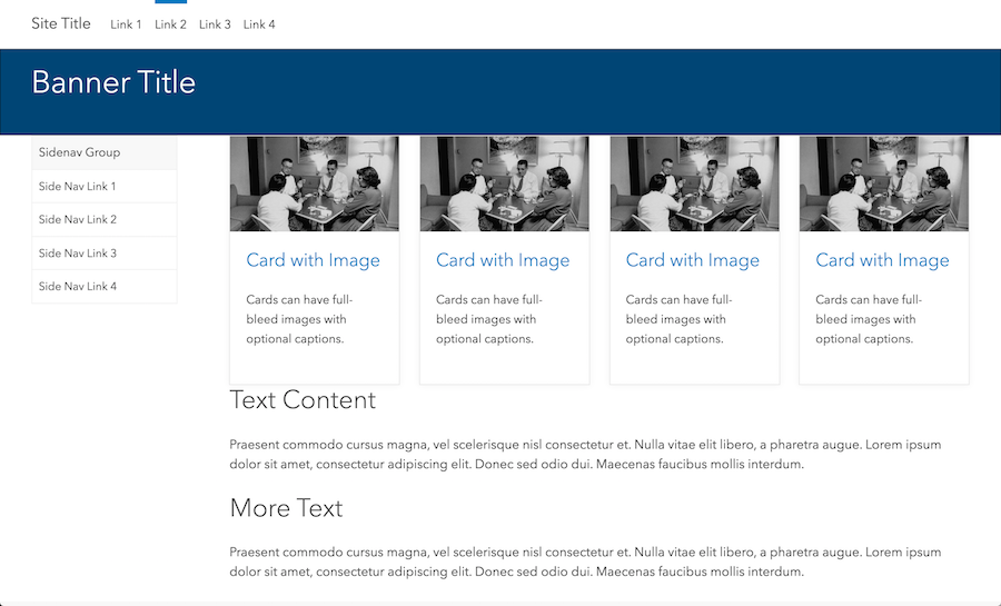
Not bad!
4. Tweak with Modifier Classes
As you can see, there are a number of things that are currently different from our design. Some things are too cramped, and others aren't aligned properly. In order to quickly fix what's wrong, we'll use Calcite Web's built in grid modifier classes and type modifier classes.
These are really powerful single-purpose classes that allow you to do things like change the font weight add space, change colors, or change display on different screen sizes.
Let's fix the banner first. In the original design, we wanted our banner to be taller, with more space above and below the text. We can do this with the leader and trailer classes.
<div class="column-24 leader-5 trailer-5">
  <h1>Banner Title</h1>
</div>
That adds five lines of spacing above and below the title. But there's still something wrong, our text isn't centered! To fix that we'll use one of our handy dandy text modifier classes, namely text-center:
<h1 class="text-center">Banner Title</h1>
There's also no space below the banner, so let's add some space with our trailer class on the dark blue panel as well:
<div class="panel panel-dark-blue trailer-2">
Looks like the text content needs a bit of space above it as well. We could add it below the cards, or as a leader on the h2:
<h2 class="leader-1">Text Content</h2>
Lastly, let's take care of the footer as well. The headers don't look quite bold enough. Adding the avenir-bold class will make them a little stronger:
<h6 class="font-size--2 avenir-bold">Header 3</h6>
Notice there is already a font-size class on the header. Using these font-size modifiers, you can make type larger or smaller. Just use any number from font-size--3 to font-size-6. font-size-0 is the default and you can go up and down from there.
We also want the footer to have more space below it. We can do this with the padding-trailer classes. These work just like leader and trailer but they modify padding instead of margin:
<div class="footer padding-trailer-1" role="contentinfo">
Finally, the text in the footer seems a bit too dark. To lighten it up, we can use the text-color classes.
<div class="footer padding-trailer-1 text-darkest-gray" role="contentinfo">
For the links, we'll use the link-color classes:
<a class="link-darker-gray" href="#">Link 1</a>
<a class="link-darker-gray" href="#">Link 2</a>
<a class="link-darker-gray" href="#">Link 3</a>
5. Making it Mobile
If you've been following along and you resize your browser, you'll notice that certain things look weird. Calcite Web tries to do as much as it can for you automatically, but guess how you can fix the stuff that's broken? That's right, more modifier classes!
For example, the block group we're using for our cards looks pretty bad on mobile because there is no space for four cards anymore. To fix this, we can use the docs for responsive block-groups. Turns out we can control how many cards are in a row:
<div class="block-group block-group-4-up tablet-block-group-2-up">
Now from the tablet size down there will only be two cards in a row. We can also add space with tablet-leader- and tablet-trailer classes. Let's add space above the cards on tablet:
<div class="card block tablet-leader-1">
6. Wrapping Up
You can check out the final result here. It looks pretty close to the original design, and all without writing a single line of CSS. Calcite Web helps you make pages that are fast, accessible, responsive, and work in a variety of languages. Be sure to read more of the docs and start building!