Components
Components are reusable blocks that can be used across any part of a Calcite site. They can be used within patterns or on their own.
Buttons
Buttons are created by adding a class of btn to either a <button> or <a> element. btn-{color} classes can be mixed with btn-{style} classes.
<a href="#" class="btn"> Button </a>
<button class="btn">  Button </button>
<button class="btn btn-red btn-arrow">  Red Button with Arrow </button>
Button Links
Sometimes, the proper semantic element is a button, but you would rather the element look more like a link. In these instances, Calcite Web provides an alternate class btn-link which styles a button element as if it were a simple anchor:
<button class="btn-link">This is a button</button>
Base
.btn
<button class="btn modifier-class"> btn modifier-class </button>
Modifiers
.btn-transparent
.btn-clear
.btn-clear-white
.btn-small
.btn-large
.btn-fill
.btn-half
.btn-disabled
.btn-white
.btn-red
.btn-green
Button Groups
Button groups are ... groups of buttons. The button group allows for sets of buttons to be directly adjacent to each other without borders or margins interfering.
.btn-grouped
<nav class="leader-1">
  <button class="btn btn-grouped">One</button>
  <button class="btn btn-grouped">Two</button>
  <button class="btn btn-grouped">Three</button>
</nav>
Labels
Labels are a way to call attention to a word. The mark element, a notification count, or an important indicator (like marking a technology as 'beta' or 'private') are all use cases for labels.
Labels should be limited to one or two words and should only be used in situations where the content in the label is quite important. Labels are sized in em units, so they will scale up with whatever element they are inside.
Base
.label
<mark class="label modifier-class">beta</mark>
Modifiers
.label-blue
.label-green
.label-yellow
.label-red
Dropdowns
Dropdowns rely on the
calcite-web.jsJavaScript library for their functionality. See the JavaScript Documentation for more information.
Dropdowns are good for showing multiple options under a single call to action. For example, if you had a download button, and you needed the user to choose a format for the download, you could put several choices in a dropdown.
Dropdowns differ from select elements in that they don't have a default state or a 'current' state. Instead, they offer a jumping off point for a series of related actions.
Note: Be sure to give the elements inside your dropdown the role of menuitem to ensure they're accessible to screen readers.
Base
.dropdown
<div class="dropdown js-dropdown">
  <!-- extends side-nav -->
  <button class="btn btn-transparent dropdown-btn js-dropdown-toggle" tabindex="0" aria-haspopup="true" aria-expanded="false">
    Dropdown Select
    <svg xmlns="http://www.w3.org/2000/svg" width="18" height="18" viewBox="0 0 32 32" class="svg-icon"><path d="M28 9v5L16 26 4 14V9l12 12L28 9z"/></svg>
  </button>
  <!-- extends side-nav -->
  <nav class="dropdown-menu modifier-class" role="menu">
    <!-- extends side-nav-link -->
    <span class="dropdown-title">Some Options</span>
    <a href="#" class="dropdown-link" role="menuitem">Option 1 that has a really long text.</a>
    <a href="#" class="dropdown-link" role="menuitem">Option 2</a>
    <a href="#" class="dropdown-link" role="menuitem">Option 3</a>
    <span class="dropdown-title">More Options</span>
    <button class="dropdown-link" role="menuitem">Option 4</button>
    <a href="#" class="dropdown-link" role="menuitem">Option 5</a>
  </nav>
</div>
Modifiers
.dropdown-right
Loader
The loader element is a placeholder while content is being retrieved or rendered. By default, the loader is set to display: none; and requires an is-active class to display.
.loader
<div class="loader is-active padding-leader-3 padding-trailer-3">
  <div class="loader-bars"></div>
  <div class="loader-text">Loading...</div>
</div>
Alerts
Alerts are used to inform users of state changes, errors, or successful actions. Alerts are only visible if they have the is-active class. Without as is-active class, the alert will be set to display: none;
Calcite does not manage alert classes by default - you will have to write your own JavaScript handlers for this.
Base
.alert
<div class="alert modifier-class is-active">
  Something Happened!
  <button class="alert-close">
    <svg xmlns="http://www.w3.org/2000/svg" width="32" height="32" viewBox="0 0 32 32" class="svg-icon">
      <path d="M18.404 16l9.9 9.9-2.404 2.404-9.9-9.9-9.9 9.9L3.696 25.9l9.9-9.9-9.9-9.898L6.1 3.698l9.9 9.899 9.9-9.9 2.404 2.406-9.9 9.898z"/>
    </svg>
  </button>
</div>
Modifiers
.alert-red
.alert-yellow
.alert-green
.alert-full
Panels
Panels are useful to draw attention or contain certain text on a page. They are simple containers, which can be used to help guide users through the visual hierarchy of your design.
Note: be sure to use the link modifier classes to style links within a panel so that they pass WCAG 2.0 accessibility color contrast. For standard light-gray panels, use link-dark-blue.
Base
This is a panel.
Panels set background-color and frame content.
.panel
<div class="panel modifier-class">
  <h4 class="trailer-half">This is a panel.</h4>
  <p class="trailer-0">Panels set <code>background-color</code> and frame content.</p>
</div>
Modifiers
This is a panel.
Panels set background-color and frame content.
.panel-no-border
This is a panel.
Panels set background-color and frame content.
.panel-no-padding
This is a panel.
Panels set background-color and frame content.
.panel-dark
This is a panel.
Panels set background-color and frame content.
.panel-black
This is a panel.
Panels set background-color and frame content.
.panel-white
This is a panel.
Panels set background-color and frame content.
.panel-light-blue
This is a panel.
Panels set background-color and frame content.
.panel-blue
This is a panel.
Panels set background-color and frame content.
.panel-dark-blue
Cards
Cards are like panels, but a little more structured. They can have titles, buttons, and full bleed images. Use cards when panels are too simple.
If you don't have an image, use the .card-bar-blue (or another color) to add some graphic punch.
Another class card-shaped allows for a stylized version of the card meant to work with geometrically-shaped images.
.card,card-shaped,card-bar-color
<div class="block-group block-group-3-up tablet-block-group-2-up phone-block-group-1-up">
<div class="card block trailer-1">
<figure class="card-image-wrap">
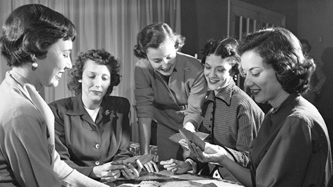
<img class="card-image" src="../../assets/img/docs/bridge3.jpg" alt="Bridge Club, 1954">
<figcaption class="card-image-caption">
Florida, January 1954
</figcaption>
</figure>
<div class="card-content">
<h4><a href="#">Card with Image</a></h4>
<p class="font-size--1 card-last">Cards can have full-bleed images with optional captions.</p>
<a href="../../examples/core/#two-up-cards" class="btn btn-fill leader-1">View Examples</a>
</div>
</div>
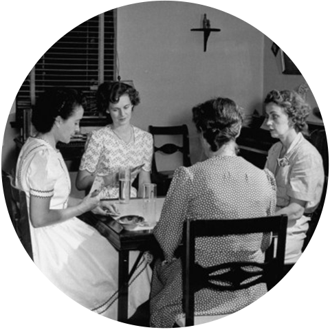
<div class="card card-shaped block trailer-1">
<figure class="card-image-wrap">
<img src="../../assets/img/docs/bridge-circle.png" alt="Bridge Club, 1942" class="card-image">
</figure>
<div class="card-content">
<p class="font-size--1 card-last">Another class <code>card-shaped</code> allows for a stylized version of the card meant to work with geometrically-shaped images.</p>
<a href="../../examples/core/#two-up-cards" class="btn btn-clear btn-fill leader-1">View Examples</a>
</div>
</div>
<div class="card card-bar-blue block trailer-1">
<div class="card-content">
<h4>Card with Colored Bar</h4>
<p class="font-size--1 card-last">Every color can in calcite can be used as a colored "bar" along the top of a card to provide a bit visual punch with <code>.card-bar-{color}</code>.</p>
<a href="../color/#ui-colors" class="btn btn-clear btn-fill leader-1">What colors?</a>
</div>
</div>
</div>
Wide Cards
For list views, cards can also be used in landscape orientation. The full bleed image will crop itself to fill the available space.
Wide Cards
Wide cards are just like standard cards except that they are displayed in landscape orientation. This is useful in situations where there is too much content to display well in a standard card.
Generally wide cards are meant to be displayed one-up, not grouped.
.card-wide
<div class="card card-wide">
  <figure class="card-wide-image-wrap">
    <img class="card-wide-image" src="../../assets/img/docs/bridge3.jpg" alt="Bridge Club, 1954">
    <div class="card-image-caption">
      Florida, January 1954
    </div>
  </figure>
  <div class="card-content">
    <h4 class="trailer-half"><a href="#">Wide Cards</a></h4>
    <p class="font-size--1 trailer-half">Wide cards are just like standard cards except that they are displayed in landscape orientation. This is useful in situations where there is too much content to display well in a standard card.</p>
    <p class="font-size--1 trailer-half">Generally wide cards are meant to be displayed one-up, not grouped.</p>
    <span class="icon-ui-favorites icon-ui-yellow icon-ui-flush"></span>
    <span class="icon-ui-favorites icon-ui-yellow icon-ui-flush"></span>
    <span class="icon-ui-favorites icon-ui-yellow icon-ui-flush"></span>
    <span class="icon-ui-favorites icon-ui-gray icon-ui-flush"></span>
    <span class="icon-ui-favorites icon-ui-gray icon-ui-flush"></span>
  </div>
</div>
Breadcrumbs
Breadcrumbs are a set of links or spans inside of a <nav> element. The crumb class will take care of spacing, alignment, and icons. Normal text and link helpers can be applied to breadcrumbs to allow for a range of contexts.
Base
.breadcrumbs,crumb
<nav class="breadcrumbs modifier-class">
  <a href="#" class="crumb">Thing</a>
  <span class="crumb">Thing</span>
  <a href="#" class="crumb">Thing</a>
  <a href="#" class="crumb">Thing</a>
  <a href="#" class="crumb is-active">Current</a>
</nav>
Modifiers
.breadcrumbs-white
Tooltips
Tooltips use an aria-label attribute to provide contextual help on hover. Tooltips can apply to any element.
Base
Tooltips can be single line: single line tooltip
Tooltips can also have more than one line. Just use the tooltip-multiline class:
multiline tooltip
.tooltip,tooltip-multiline
<p>
  Tooltips can be single line: <a class="tooltip modifier-class" aria-label="This is the message of the tooltip">single line tooltip</a>
</p>
<p>
  Tooltips can also have more than one line. Just use the <code>tooltip-multiline</code> class:
  <span class="tooltip tooltip-multiline modifier-class" aria-label="This is a tooltip with a quite large message if I do say so myself. Probably too long for just one line."> multiline tooltip</span>
</p>
Modifiers
Tooltips can be single line: single line tooltip
Tooltips can also have more than one line. Just use the tooltip-multiline class:
multiline tooltip
.tooltip-left
Tooltips can be single line: single line tooltip
Tooltips can also have more than one line. Just use the tooltip-multiline class:
multiline tooltip
.tooltip-right
Tooltips can be single line: single line tooltip
Tooltips can also have more than one line. Just use the tooltip-multiline class:
multiline tooltip
.tooltip-top
Tables
Tables have not been styled by default. To style your tables, you must add the table class. If you'd like to style <table> elements without a class, you can set the $namespace-tables Sass variable to false. For more information on setting Sass variables see the custom build documentation.
By default, a large table will break your layout horizontally. You can solve this problem by wrapping a table in a <div> with the .overflow-auto helper class:
<div class="overflow-auto">
  <table class="table">...</table>
</div>
Tables that are too wide for the layout will be constrained and scroll horizontally. This is especially helpful for responsive designs which scale down to be smaller than the table's minimum width.
Base
| Thing 1 | Thing 2 | Thing 3 |
|---|---|---|
| a | b | c |
| x | y | z |
.overflow-auto
<table class="table modifier-class">
  <thead>
    <tr>
      <th>Thing 1</th>
      <th>Thing 2</th>
      <th>Thing 3</th>
    </tr>
  </thead>
  <tbody>
    <tr>
     <td>a</td>
     <td>b</td>
     <td>c</td>
    </tr>
    <tr>
     <td>x</td>
     <td>y</td>
     <td>z</td>
    </tr>
  </tbody>
</table>
Modifiers
| Thing 1 | Thing 2 | Thing 3 |
|---|---|---|
| a | b | c |
| x | y | z |
.table-blue
| Thing 1 | Thing 2 | Thing 3 |
|---|---|---|
| a | b | c |
| x | y | z |
.table-striped
| Thing 1 | Thing 2 | Thing 3 |
|---|---|---|
| a | b | c |
| x | y | z |
.table-plain
| Thing 1 | Thing 2 | Thing 3 |
|---|---|---|
| a | b | c |
| x | y | z |
.table-striped table-blue
| Thing 1 | Thing 2 | Thing 3 |
|---|---|---|
| a | b | c |
| x | y | z |
.table-no-table
Skip to Content
Used at the beginning of a page to allow keyboard and screen reader navigation to the primary content of the page without navigation through all the links that precede the content.
.skip-to-content
<a class="skip-to-content" href="#skip-to-content">Skip To Content</a>

<div id="skip-to-content" tabindex="0"></div>
Responsive Images
Creating a number of file sizes for bitmap assets can be very useful for reducing load times on small screens - especially phones and tablets. While this image markup is not enforced or unique to Calcite Web (there is no code in the framework that enables this), the following examples should be used as a standard when implementing responsive images.
A full range of images widths are listed below.
${title}.jpg
${title}-1920-xlg.jpg
${title}-960-lg.jpg
${title}-640-bmd.jpg
${title}-480-md.jpg
${title}-320-smd.jpg
${title}-240-sm.jpg
${title}-160-xsm.jpg

<img srcset="../../assets/img/docs/image-1920-xlg.jpg 192w,
             ../../assets/img/docs/image-960-lg.jpg   960w,
             ../../assets/img/docs/image-480-md.jpg   480w"
     src="../../assets/img/docs/image.jpg"
     alt="24 column or fulscreen image.">

<img srcset="../../assets/img/docs/image-960-lg.jpg   960w,
             ../../assets/img/docs/image-480-md.jpg   480w,
             ../../assets/img/docs/image-240-sm.jpg   240w"
     src="../../assets/img/docs/image.jpg"
     alt="12 column or two up image.">

<img srcset="../../assets/img/docs/image-640-bmd.jpg  640w,
             ../../assets/img/docs/image-320-smd.jpg  320w,
             ../../assets/img/docs/image-160-xsm.jpg  160w"
     src="../../assets/img/docs/image.jpg"
     alt="8 column or three up image">
Forms
Labels for form elements should describe what the field is. Labels should not be followed by a colon. Placeholder text should describe the specifics about formatting or examples for the input text. Placeholder text is optional, and should never be used to replace a label.
Required form fields should be have the required attribute. While optional form fields should be clearly marked with "(optional)".
Try not to include too many optional fields, as it will make the form harder to comprehend and complete for the user.
<form action="" method="post">
  <label>
    Email
    <input type="email" required placeholder="bob@example.com">
  </label>
  <label>
    Confirm Email
    <input type="email" required disabled>
  </label>
  <label>
    Gender
    <select name="gender" required>
      <option value="male">Male</option>
      <option value="female">Female</option>
      <option value="other">Other</option>
    </select>
  </label>
  <label>
    Birthday
    <input type="date" placeholder="mm/dd/yyyy" required>
  </label>
  <label>
    Message
    <textarea placeholder="Briefly describe what isn't working, max 240 characters" rows="5" required></textarea>
  </label>
  <label>
    How many do you want?
    <input type="range" min="0" max="100" value="50" step="1" aria-valuemin="0" aria-valuemax="100" aria-valuenow="50">
  </label>
  <label>
    How many do you need?
    <input type="range" min="0" max="100" value="25" step="25" aria-valuemin="0" aria-valuemax="100" aria-valuenow="25">
  </label>
<label class="toggle-switch">
  <input type="checkbox" class="toggle-switch-input">
  <span class="toggle-switch-track margin-right-1"></span>
  <span class="toggle-switch-label font-size--1">Inline example</span>
</label>
<label class="toggle-switch toggle-switch-destructive clearfix">
  <span class="toggle-switch-label right font-size--1">Confirm account deletion. You cannot recover deleted accounts.</span>
  <input type="checkbox" class="toggle-switch-input">
  <span class="toggle-switch-track left"></span>
</label>
<label class="toggle-switch clearfix">
  <span class="toggle-switch-label left font-size--1">Enable Two-Factor Authentication</span>
  <input type="checkbox" class="toggle-switch-input" checked>
  <span class="toggle-switch-track right"></span>
</label>

  <fieldset class="fieldset-checkbox">
    <legend>Email Preferences (optional)</legend>
    <label>
      <input type="checkbox"> Weekly Newsletter
    </label>
    <label>
      <input type="checkbox"> Monthly Newsletter
    </label>
    <label>
      <input type="checkbox"> All Emails
    </label>
  </fieldset>
  <fieldset class="fieldset-radio">
    <legend>How did you hear about us? (optional)</legend>
    <label>
      <input type="radio" name="source" value="friend">Friend
    </label>
    <label>
      <input type="radio" name="source" value="event">Sponsored Event
    </label>
    <label>
      <input type="radio" name="source" value="other">Other
    </label>
  </fieldset>
  <label>
    Upload profile photo
    <input type="file">
  </label>
  <button type="submit" class="btn">Submit</button>
</form>
Form Validation
Basic classes are also provided to style form fields after validation. In order to show that a field passes or fails your validation rules, you can use the input-success and input-error classes on the form field.
In the case of form errors we recommend you also use the input-error-message in order to explain to the user what went wrong. input-error-message is hidden by default, so you must add the is-active class to it for it to show.
<label>
  First Name
  <input type="text" class="input-success" value="Tom" required>
</label>

<label>
  Password
  <input type="text" required placeholder="At least 12 characters long" class="input-error">
  <div class="input-error-message is-active">
    Password does not meet minimum password requirements.
  </div>
</label>
Text Inputs
Text inputs should be placed inside a label element. See the form validation for a more complete input-error example.
Base
<label>
  Label Text
  <input type="text" placeholder="descriptive or sample text" class="modifier-class" required>
</label>
Modifiers
.input-success
.input-error
.input-search
.input-search input-minimal
Input Groups
It is very common to have an input and a button attached to one another. The input-group component allows you to accomplish this with three classes.
.input-group,input-group-input,input-group-button
<div class="input-group">
  <input class="input-group-input" type="text" placeholder="Username">
  <span class="input-group-button">
    <button class="btn">Yay</button>
  </span>
</div>
Selects
Selects can be made full-width by using the select-full class. Styles for multiple selects are also provided.
Base
<label>
  Select Menu:
  <select class="modifier-class">
    <option value="">Menu 1</option>
    <option value="">Menu 2</option>
    <option value="">Menu 3</option>
    <option value="">Menu 4</option>
  </select>
</label>
Modifiers
.select-full
Sliders
This is a simple range slider input component to provide consistent cross-browser styles. In the future we hope to add more functionality via opt-in js classes.
<form class="calcite-slider" id="example1">
  <label>
   Default Range Slider
    <input type="range" min="0" max="100" value="50" step="1" aria-valuemin="0" aria-valuemax="100" aria-valuenow="50">
  </label>
</form>
Switches
In addition to inline display, we also provide support for both left- and right- aligned copy through use of Calcite helper classes. We provide a warning style for destructive actions, such as deleting items or accounts. Enabling RTL will swap the orientation of the handle within the track as well as the layout of the label and switch.
Base
.toggle-switch
<label class="toggle-switch modifier-class">
  <input type="checkbox" class="toggle-switch-input">
  <span class="toggle-switch-track margin-right-1"></span>
  <span class="toggle-switch-label font-size--1">Inline example</span>
</label>
<label class="toggle-switch modifier-class clearfix">
  <span class="toggle-switch-label right font-size--1">I'd like to receive email notifications about this product</span>
  <input type="checkbox" class="toggle-switch-input">
  <span class="toggle-switch-track left"></span>
</label>
<label class="toggle-switch modifier-class clearfix">
  <span class="toggle-switch-label left font-size--1">Enable Two-Factor Authentication</span>
  <input type="checkbox" class="toggle-switch-input" checked>
  <span class="toggle-switch-track right"></span>
</label>
Modifiers
.toggle-switch-destructive
Checkboxes
Checkboxes are aligned properly and given a focus state consistent with other form elements. Other than that they are left as is.
.fieldset-checkbox
<fieldset class="fieldset-checkbox">
  <legend>Checkbox Label:</legend>
  <label><input type="checkbox">Check Box 1</label>
  <label><input type="checkbox">Check Box 2</label>
</fieldset>
Radio Buttons
Much like checkboxes, radio buttons are largely left alone except for alterations in spacing and focus state.
.fieldset-radio
<fieldset class="fieldset-radio">
  <legend>Choose One Color</legend>
  <label><input type="radio" name="color" value="blue">Blue</label>
  <label><input type="radio" name="color" value="red">Red</label>
  <label><input type="radio" name="color" value="green">Green</label>
</fieldset>
Radio Group
The radio group component provides an additional style with more visual prominence than a plain select or radio.
It is structured as a typical radio input for accessibility.
.radio-group
<fieldset class="radio-group">
  <legend class="radio-group-title">Choose your framework</legend>
  <input class="radio-group-input" type="radio" id="react" name="framework" checked/>
  <label class="radio-group-label" for="react">React</label>
  <input class="radio-group-input" type="radio" id="ember" name="framework"/>
  <label class="radio-group-label" for="ember">Ember</label>
  <input class="radio-group-input" type="radio" id="angular" name="framework"/>
  <label class="radio-group-label" for="angular">Angular</label>
  <input class="radio-group-input" type="radio" id="vue" name="framework"/>
  <label class="radio-group-label" for="vue">Vue</label>
</fieldset>
Animation
Animation helper classes are used to provide character, visual richness, and tactile feedback for the user. Adding an .animate- class to any DOM node will animate that node. Using JavaScript to add .animate-fade-in to a DOM node when it enters the viewport will cause that node to fade in.
Wakko packs away the snacks, while Bill Clinton plays the sax.
<div class="modifier-class js-animation">
  <h3>Wakko packs away the snacks, while Bill Clinton plays the sax.</h3>
</div>
Modifiers
Wakko packs away the snacks, while Bill Clinton plays the sax.
.animate-fade-in
Wakko packs away the snacks, while Bill Clinton plays the sax.
.animate-fade-out
Wakko packs away the snacks, while Bill Clinton plays the sax.
.animate-in-down
Wakko packs away the snacks, while Bill Clinton plays the sax.
.animate-in-up
Wakko packs away the snacks, while Bill Clinton plays the sax.
.animate-out-down
Wakko packs away the snacks, while Bill Clinton plays the sax.
.animate-out-up
Branding
Esri Logo
A minimum buffer zone of clear space is maintained around the logo. Display of the logo should not be less than 78 x 28 pixels. This minimun size and buffer is part of the component, designed to be as simple to use as possible.
Use of the reverse logo should only be on top of dark backgrounds. Neither logo should be used on top of images, or altered in any way.
Base
.esri-logo
<div class="esri-logo modifier-class"></div>
Modifiers
.esri-logo-reverse
.esri-logo-condensed