Patterns (v0.4.3+ Styles)
Note to Developers: In order to include these, your app must include the Calcite Bootstrap expansion files.
The structure to achieve the four types of Calcite cards is displayed below. Critically, the cards must be wrapped in a .calcite-web class either at a container level or around the individual cards themselves.
Wide Cards
Wide cards are just like standard cards except that they are displayed in landscape orientation. This is useful in situations where there is too much content to display well in a standard card.
Generally wide cards are meant to be displayed one-up, not grouped.
<div class="col-xs-12">
<div class="calcite-web">
<div class="card-base card-wide">
<div class="card-wide-image-wrap">
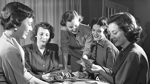
<img alt="Bridge Club, 1954" class="card-wide-image" src="http://esri.github.io/calcite-web/assets/img/docs/bridge3.jpg">
<div class="card-image-caption">
Florida, January 1954
</div>
</div>
<div class="card-content">
<h4><a href="#">Wide Cards</a></h4>
<p>Wide cards are just like standard cards except that they are displayed in landscape orientation. This is useful in situations where there is too much content to display well in a standard card.</p>
<p>Generally wide cards are meant to be displayed one-up, not grouped.</p><span class="glyphicon glyphicon-star"></span> <span class="glyphicon glyphicon-star"></span> <span class="glyphicon glyphicon-star"></span> <span class="glyphicon glyphicon-star-empty"></span> <span class="glyphicon glyphicon-star-empty"></span>
</div>
</div>
</div>
</div>For best results and mobile support, use 736x414 px for thumbnails. However, 294x194 px can be used for fixed .col-xs-4 cards.
Card with Image
Cards can single buttons or button groups with inline justified buttons.
<div class="col-xs-12 col-sm-6 col-md-4">
<div class="calcite-web">
  <div class="card-base">
    <div class="card-image-wrap">
      <img alt="Bridge Club, 1954" class="card-image" src="http://esri.github.io/calcite-web/assets/img/docs/bridge3.jpg">
      <div class="card-image-caption">
        Florida, January 1954
      </div>
    </div>
    <div class="card-content">
      <h4><a href="#">Card with Image</a></h4>
      <p>Cards can single buttons or button groups with inline justified buttons.</p>
      <div aria-label="actions" class="btn-group btn-group-justified" role="group">
        <a class="btn btn-default" href="#">Details</a><a class="btn btn-primary" href="#">View</a>
      </div>
    </div>
  </div>
</div>
</div>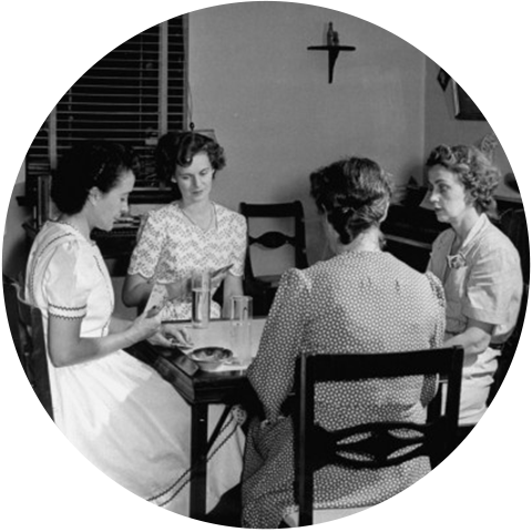
Another class card-shaped allows for a stylized version of the card meant to work with geometrically-shaped images.
<div class="col-xs-12 col-sm-6 col-md-4">
  <div class="calcite-web">
    <div class="card-base card-shaped">
      <figure class="card-image-wrap">
        <img class="card-image" src="http://esri.github.io/calcite-web/assets/img/docs/bridge-circle.png">
      </figure>
      <div class="card-content">
        <p>Another class <code>card-shaped</code> allows for a stylized version of the card meant to work with geometrically-shaped images.</p><a class="btn btn-default" href="">View Examples</a>
      </div>
    </div>
  </div>
</div>
Top Border
To change the color of the Top Border card, any of the Calcite color in their existing naming convention can be used in place of .card-bar-purple-dark. Therefore, to use gray-lighter the class would be .card-bar-gray-lighter. To see the list of available preset top border colors, check out the expansions file.
<div class="col-xs-12 col-sm-6 col-md-4">
  <div class="calcite-web">
    <div class="card-base card-bar-purple-dark">
      <div class="card-content">
        <h4>Card with Colored Bar</h4>
        <p>Every color can in calcite can be used as a colored "bar" along the top of a card to provide a bit visual punch with <code>.card-bar-{color}</code>.</p><a class="btn btn-default" href="">What colors?</a>
      </div>
    </div>
  </div>
</div>
Mike Parker
Some quick example text to build on the card title and make up the bulk of the card's content.
<div class="col-xs-12 col-sm-6 col-md-4">
  <div class="calcite-web">
    <div class="card-base card-profile">
      <div class="card-image-wrap"><img alt="profile image" class="card-img-circle center-block" src="https://randomuser.me/api/portraits/men/75.jpg"></div>
      <div class="card-content text-center">
        <h4>Mike Parker</h4>
        <p>Some quick example text to build on the card title and make up the bulk of the card's content.</p><span class="social-share-links"><a href="#"><i class="glyphicon glyphicon-link"></i> LinkedIn</a></span>
      </div>
    </div>
  </div>
</div>
Statistic
The three associated states with this card are: ontrack, info, failing. To change the card to reflect these states, there are two places that classes need to be updated. Inside the .measure-icon class, the <span> needs one of three classes: .status-ontrack-bg,.status-info-bg,.status-failing-bg and the complimentary class that should also be applied alongside .card-content should be .status-ontrack,.status-info,.status-failing. Choice of glyphicon is flexible as color is attached to the <i> tag.
<div class="col-xs-12 col-sm-6 col-md-4">
  <div class="calcite-web">
    <div class="card-base measure-card">
      <div class="measure-icon">
        <span class="status-ontrack-bg"></span><i class="glyphicon glyphicon-home"></i>
      </div>
      <div class="card-content status-ontrack">
        <h3>Public Housing Occupancy Rate</h3>
        <h4>88.8</h4>
        <p><i class="glyphicon glyphicon-chevron-up" aria-label="increase"></i> percent occupied</p>
        <div class="citation">
          Source: <a href="#">Davenport Housing Authority</a>
        </div>
      </div>
    </div>
  </div>
</div>
<div class="col-xs-12 col-sm-6 col-md-4">
  <div class="calcite-web">
    <div class="card-base measure-card">
      <div class="measure-icon">
        <span class="status-info-bg"></span><i class="glyphicon glyphicon-home"></i>
      </div>
      <div class="card-content status-info">
        <h3>Residents Assisted by Federal Programs</h3>
        <h4>1,011</h4>
        <p><i class="glyphicon glyphicon-stats" aria-label="stat"></i> residents assisted</p>
        <div class="citation">
          Source: <a href="#">Davenport Housing Authority</a>
        </div>
      </div>
    </div>
  </div>
</div>
<div class="clearfix visible-md-block"></div>
<div class="col-xs-12 col-sm-6 col-md-4">
  <div class="calcite-web">
    <div class="card-base measure-card">
      <div class="measure-icon">
        <span class="status-failing-bg"></span><i class="glyphicon glyphicon-file"></i>
      </div>
      <div class="card-content status-failing">
        <h3>Rental Inspections Completed</h3>
        <h4>14</h4>
        <p><i class="glyphicon glyphicon-chevron-down" aria-label="decrease"></i> last month</p>
        <div class="citation">
          Source: <a href="#">Davenport Housing Authority</a>
        </div>
      </div>
    </div>
  </div>
</div><ul class="cards-list">
<li class="col-xs-12 col-sm-6 col-md-4">
<div class="card center-block">
<a href="#" target="_blank"><img alt="Card Thumbnail" src="https://s3.amazonaws.com/geohub-assets/templates/public-engagement/survey-123-th.jpg"></a>
<div class="card-options">
<a class="btn btn-default" href="#" target="_blank">Take Me There</a>
</div>
<h6>Local Perspective</h6>
<p>Hear from your community.</p>
</div>
</li>
</ul>