geodev-hackerlabs
Web AppBuilder Custom Theme
In this lab you will add a custom Theme to Web AppBuilder.
-
Download the Hackerlab Theme unzip it and copy the folder to the themes directory for Web AppBuilder (webappbuilder\client\stemapp\themes). Make sure Web AppBuilder isn’t running.
-
Click the HackerlabTheme folder and edit the manifest.json to describe the theme’s content as below (styles, panels, and layouts). This informs Web AppBuilder which files to load for the theme.
 {
  "name": "HackerlabTheme",
  "platform": "HTML",
  "panels": [
    {
      "name": "FoldablePanel",
      "description": "This is foldable panel"
    }
  ],
  "styles": [
    {
      "name": "default",
      "description": "this is default style",
      "styleColor": "#2196f3"
    },
    {
      "name": "medium-gray",
      "description": "this is gray style",
      "styleColor": "#6E6E6E"
    },
    {
      "name": "black-gray",
      "description": "this is black gray style",
      "styleColor": "#2E3641"
    },
    {
      "name": "white",
      "description": "this is white with blue style",
      "styleColor": "#FFFFFF"
    }
  ],
  "layouts": [
    {
      "name": "default",
      "description": "this is default layout"
    }
  ],
  "widgets": [
    {
      "name": "HeaderController",
      "description": "this is theme widget controller"
    }
  ],
  "version": "2.1",
  "wabVersion": "2.1",
  "author": "Esri Inc",
  "description": "HackerlabTheme",
  "copyright": "",
  "license": "http://www.apache.org/licenses/LICENSE-2.0"
}
-
Launch Web AppBuilder using the startup batch file. Create a New Default (2D) app. Give it a title
Custom Themeand clickOK. -
Click the HackerlabTheme and click
Save. Notice the defaultStyleis light blue and contains oneLayout, but the header controller is dark gray. You are going to style this theme using CSS. -
Click the
HackerlabTheme\styles\defaultfolder and edit the style.css. Make sure you save your changes after each step. Throughout this lab you will see the name jimu which is the [Jimu CSS framework] (https://developers.arcgis.com/web-appbuilder/api-reference/css-framework.htm) in Web AppBuilder.- Import a new font and change the background color.
@import url(//fonts.googleapis.com/css?family=Ubuntu); .jimu-main-font{ font-family: 'Ubuntu'; } .jimu-main-background{ background-color: #fff; }- Add a blue background color and opacity for the default widgets on the map.
.jimu-widget-homebutton, .jimu-widget-mylocation, .jimu-widget-zoomslider .zoom, .jimu-widget-homebutton .HomeButton .home, .jimu-widget-mylocation .place-holder{ background-color: #2196f3; opacity: .9; }- Change the title and subtitle colors in the header to gray.
.jimu-title, .jimu-subtitle { color: #323232; }- Remove the shadow and add a border.
.jimu-widget-header-controller{ -moz-box-shadow: none; -webkit-box-shadow: none; box-shadow: none; border-bottom: 2px solid #323232; } -
To see the changes you just implemented in the Web AppBuilder GUI select any theme other than Hackerlab Theme (e.g. Foldable theme) and click
Save, then select the Hackerlab Theme. This refreshes the Custom Theme application by using the current theme selected. -
Now that the default style has been modified, the widget icons in the header controller are not visible and they need to be resized.
- Make the icon nodes smaller, add margin properties, and border radius.
.jimu-widget-header-controller .icon-node{ opacity: 1; background: #323232; border-right: 0; height: 30px !important; width: 30px !important; margin-top: 4px; margin-right: 10px; -moz-box-radius: 50%; -webkit-border-radius: 50%; border-radius: 50%; }- Make the icon images smaller.
     .jimu-widget-header-controller .icon-node img{
       height: 14px;
       width: 14px;
     }
-
Web AppBuilder has state classes which do not have any CSS rules. Add selected state styles to match the current theme of blue when an icon is selected.
.jimu-widget-header-controller .icon-node.jimu-state-selected{ border-top: 0; background-color: #2196f3; } -
Widgets can be grouped when the group display mode is
show in Dropdown Menuin the HeaderController widget. To align the drop-down caret correctly, place the drop-down caret at the bottom of the icon node..jimu-widget-header-controller .drop-triangle{ bottom: 5px; margin-left: -5px; }- Change the background color of the drop-down menu to dark gray.
.jimu-widget-header-controller .jimu-drop-menu { background-color: #323232; }- Make the widget icons in the drop-down menu the same size as other widget icons and align them correctly.
.jimu-widget-header-controller .jimu-drop-menu .menu-item img{ width: 14px; height: 14px; margin-top: 13px; }- Make the text labels in the drop-down menu smaller and change the link color in the header to gray.
     .jimu-widget-header-controller .jimu-drop-menu .menu-item .label{
       font-size: 12px;
     }
     .jimu-link:link, .jimu-link:visited{
       color: #848484;
     }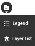
-
The HeaderController in this theme has the ability to wrap any widget icons into more widgets pop-up when there isn’t enough space. Add a more widgets icon
 and restyle the pop-up.
- Change the overlay DIV to opaque white and change the background color of the pop-up to black.
.jimu-more-icon-cover{ background-color: #323232; opacity: 65; } .jimu-header-more-popup { background-color: #000; }- Change the background color of the icon tiles, pop-up footer, and close button.
.jimu-header-more-popup .icon-node { background-color: #323232; } .jimu-header-more-popup .points{ background: #000; } .jimu-header-more-popup .close, .jimu-header-more-popup .close-inner{ background-color: #2196f3; }- Make the pagination dots smaller and apply white (normal state) and blue (active state) background colors.
.jimu-header-more-popup .points-inner { position: relative; top: -3px; } .jimu-header-more-popup .point { width: 5px; height: 5px; background-color: #fff; } .jimu-header-more-popup .point-selected { background-color: #2196f3; }- Resize the icon images.
    .jimu-header-more-popup img {
      height: 25px !important;
      width: 25px !important;
    }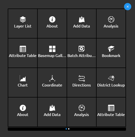
-
The panel widgets include foldable panel and on-screen panel. Change the background color of the title panes to blue and remove the borders.
.jimu-on-screen-widget-panel>.jimu-panel-title, .jimu-foldable-panel>.jimu-panel-title, .jimu-title-panel>.title{ background-color: #2196f3; } .jimu-panel{ border: 0; } -
Change the background color of the pop-up’s title pane to blue.
.esriPopup .titlePane { background-color: #2196f3; } -
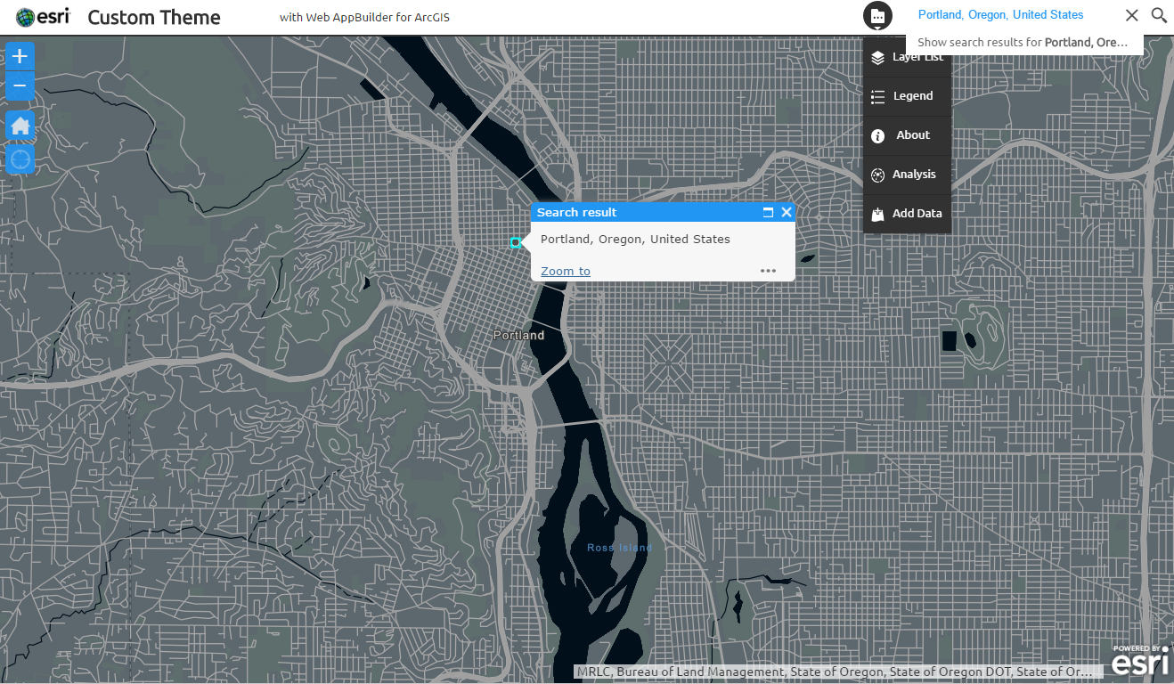
Override the default CSS for the search widget to match the current style.
- Remove the borders and change the color for the search button hover and focus.
.jimu-widget-search .arcgisSearch .searchBtn{ padding: 6px; border: none; } .jimu-widget-search .arcgisSearch .searchBtn:hover, .jimu-widget-search .arcgisSearch .searchBtn:focus{ background-color: #fff; color: #2196f3; }- Change the color and font size and remove the borders for the search input.
.jimu-widget-search .arcgisSearch .searchGroup .searchInput{ color: #2196f3; font-size: 12px; border: none; } -
Now refresh the Custom theme application and test your theme by adding some widgets and grouping them in the Header Controller.
Your code should look like this: